
Improved Flow Entry Rate
Adding the user’s Loan Number to the header builds reputability, leading to higher initiation/flow entry rate.
Reduced Time on Task
Redesigned flow to better guide the user and have clearer instructions by reducing friction on key screens.
Reduced Abandonment Rate
Branding & a cleaner layout directs the users eye & builds trust, leading to less hesitation on each screen.
Increased Adoption
Users who received a verbal notice that they would receive an invitation to the flow had higher completion rates regardless of optimization.
Truv API provides mortgage lenders with seamless verification of their borrowers income, employment, assets, and insurances. Lending officers (LOs) simple fill out an order form in the Truv dashboard, specifying their needs from the borrower and when submitted an email is sent to the borrower. The borrower is then asked to verify their necessary financial information in order for the LO to process their loan application. This saves LOs and borrowers time and hassle from having to track down PDFs and manually back and forth communication. After the borrower verifies their accounts a report is generated for the LO allowing them to easily review, verify, and decide on the borrowers loan status. In this case study we will discover where improvements can be made in order to increase successful completion rates.
The current conversion rates of 40-65% indicate significant room for improvement in user engagement and trust. When investigating further we find that we are losing users gradually along the entire flow meaning we need to collect qualitative data to accompany our quantitative findings in order to tell a more complete data story.
Conversion rate
Conversion rate
• Where are borrowers falling off during the flow?
• What qualitative data do we have around these points?
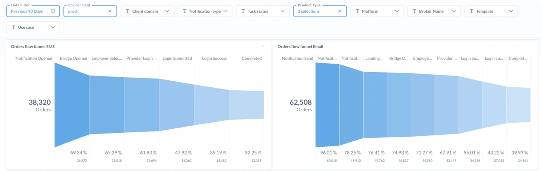
In this flow funnel we learn that the drop offs coming from both SMS & Email are gradual with more prevalent failures accusing after logins are attempted. This is typical as could be due to a forgotten among other credential related issues. We also learn that email has a much higher conversion rate than SMS so we must be careful not to alter emails so much that we actually lose conversion.
Summary
1. Focus on friction points (forgot password)
2. Risk is high when testing. Make small incremental changes to prevent negative feedback.
Conducted 7 user feedback interviews.


These users had either successfully or unsuccessfully completed the process. Some with problems and some without. We were able to ascertain some degree of insight or feedback from almost each user. Generally friction points existed in the edge cases and most users actually find the process to be fairly straightforward if not at least functionally sound.
Borrowers
📬 Personalization & Trust
🤷🏻 Guidance
😖 Overload
🧠 Clarity
🧠 Clarity
Lending officers
💻 Functionality
💻 Copy
• Let’s explore how to guide users with relevant support in the edge cases like, forgot password.
• Improving UI will increase aesthetic usability boosting trust.
• Tie in LO information and loan number to build trust. Highlight that this process is required to move their loan forward.
Landing Page
Centered text is harder to read when more than two lines.
Unclear that there needs to be a minimum of 2 years of required employment.
“Connect” feels permanent when this is a one time data lookup.
Hard to find answers to questions.
Feels “spamy”.
Button aligned to the bottom makes it harder to reach and gets truncated when the widget is embedded into bank flows.

Landing Page
Added pre-header deadline for urgency.
Keep same header with loan number and loan officer from the email for continuity and trust.
Left align copy for better readability.
Brief and clear instruction.
Two year progress bar lets the user know they’ve met the minimum requirement.
Clearer CTA’s for “What is Truv?” and “Contact support”
Button lined up with content ensures it appears above the fold.

Than you for taking the time to learn about my work. Give it a share with your LinkedIn community so we can grow and learn more together.